Download .txt files with SAS programs that create the graphs that appear on this page:
Online resources
The null hypothesis
A research hypothesis drives and motivates statistical testing. However, test statistics are designed to evaluate not the research hypothesis, but a specific null hypothesis. Therefore, researchers must begin by:
- specifying a null hypothesis (H0) that relates to a population parameter. This requires knowing whether the outcome of interest can be summarized as, for instance, a mean, a count, or a proportion.
For example, when we can measure the outcome variable at the interval or ratio scale, we can formulate a null hypothesis in terms of the population mean, which is designated by the greek symbol m.
H0: m=6
- identifying a test statistic that relates to the hypothesized and unknown population parameter.
In our example, which states a null hypothesis in terms of the population mean, a relevant test statistic is the t.
- calculating the test statistic (in this case, a t statistic) using sample data.
Properties of the sample mean
We calculate test statistics from information that we obtain from the sample. For example, we can calculate a t-statistic using the sample mean and sample variance. Although we collect just one sample, and therefore calculate a single sample mean, we understand that the sample that we have drawn is one of many that we might have drawn. In that respect, the sample mean is a continuous variable that could take on many values. Depending on the sample that we draw by chance, the mean's value could be anywhere on the illustrated number line. Somewhere on the number line is the true but unknown population mean m.
 To illustrate the relationship between the sample mean and the hypothetical but unknown population mean m, we add a second dimension to the "number line."

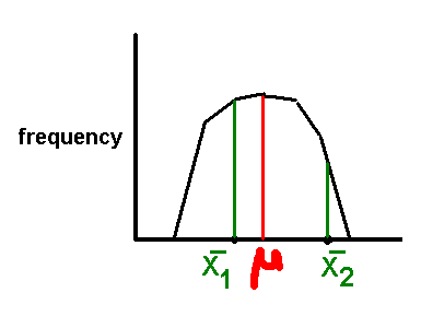
This graph's vertical axis is a "second dimension" that illustrates the results we might obtain were we to draw many samples from a population. The vertical axis summarizes the frequencies with which we might obtain particular values for the sample mean. Common sense suggests that, if we collect a sample not once but many times, the samples' means would typically be close to, and often identical to, the population mean that forms the basis of the null hypothesis. However, we'll also collect samples whose means are smaller (like that of X1) or larger (like that of X2) than the true parameter. We'll occasionally collect a sample whose mean is quite different from the true value.
We can be very specific about the relationship between the sample mean and the unknown population mean m if we can justify certain assumptions. In particular, if we can assume that we are measuring an outcome variable whose values are normally distributed, then statistical theory lets us state that the many samples that we might draw have means that are also normally distributed.
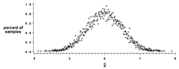
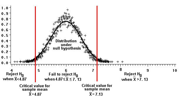
To generate the graph below, we drew 10,000 samples, each with 10 observations, from a normal population of values with a known mean (m=6) and variance (s2=2.5).

The graph's vertical axis shows how often we randomly chose samples whose means equalled the values listed on the horizontal axis. The graph illustrates how, when this particular null hypothesis (H0: m=6) is true, we will very often draw samples whose means are close to 6. In fact, statistical theory assures us that all these sample means will have a collective mean that exactly equals the population mean m. (This is true regardless of the population's distribution; it doesn't have to be normally distributed.) We expect a sample mean to equal, on average, the unknown population mean.
E(xbar) = m
where E refers to the statistic's "expected value."
The graph illustrates that we might, by chance, collect samples whose means differ greatly from the true population mean of 6 (even though the probabilities of doing so are low.) Statistical theory predicts how much sample means will vary from their expected value.
Var (xbar) = s2/n
In other words, the "sampling variance" of the sample mean variance depends on the population variance s2 and on the number n of observations in the sample. The larger the sample, the smaller the variance, that is, the more precise our estimate of the population mean.
Sampling distributions
We can construct a graph of the sample means' distribution, like the one above, for any null hypothesis as long as we specify a population mean m0 and variance s2, and are confident in assuming that the variable of interest is normally distributed. Under these assumptions, every distribution looks vaguely alike; its shape and the location of its peak differ slightly depending on the hypothesized mean and variance. To eliminate this variability, we transform the sample means to a standard distribution like the t. Transforming sample information to a t value permits quick and consistent comparisons of samples from populations with different means and variances.
Researchers are interested in sampling distributions, but not because they collect multiple samples. In practice, they generally collect a single sample for each combination of a study's independent variables. However, they understand that the they draw one sample out of many different samples that they might have drawn.
Knowing the properties of sample means lets us relate any sample mean to the population's unknown mean and variance by using the t distribution.
t = (xbar - m0) / sqrt(S2/n)
(Because we don't know the population variance, we use the the sample variance S2 to calculate the t-statistic.
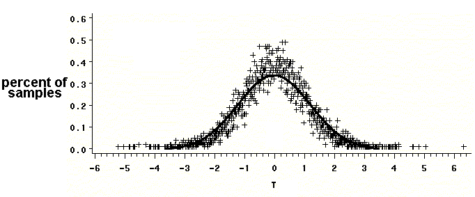
The graph below repeats the previous simulation, in which we drew 10,000 samples, each with ten observations, from a population of measurements that is normally distributed with a mean of 6 and a variance of 2.5. The horizontal axis represents, instead of sample means as in the previous simulation, the t-statistic calculated for each sample on the basis of its specific mean and variance. The graph illustrates that these t-statistics do, in fact, follow a t distribution, certain of whose values are tabulated in many statistics textbooks and online sources, including:

Reviewing the equation that calculates t-values reveals that they are a ratio of two quantities:
- the difference between the sample and population means (xbar - m0)
- the sample mean's standard deviation (sqrt(S2/n)), also called the standard error of the mean
Definition
Standard error: The standard deviation of a statistic that estimates a population parameter.
Example
Because the variance of a collection of sample means [Var(xbar)] estimates the population variance (s2) through the relationship
Var(xbar) = s2/n
and because the sample variance S2 estimates s2
then,
Var(xbar) = S2/n .
The square root of this variance, is the standard deviation of the sample mean, also called the standard error of the mean (SEM),
SEM = sqrt (S2/n)
|
|---|
Examine the t statistic and you'll see that expresses the difference between the sample mean and the hypothesized population mean as a number of standard errors of the sample mean. The graph reveals that most sample means are close to the true population mean, within one standard error above or below the sample mean. Rarely does a sample mean differ from the true mean by two standard errors or more.
Knowledge of the t distribution has produced tables that specify the probabilities of drawing samples whose means differ by various amounts from the true mean. Knowing these probabilities helps researchers decide whether the one sample they draw is consistent with the truth of the null hypothesis. This approach points up an important principle in hypothesis testing: WE BEGIN WITH THE ASSUMPTION THAT THE NULL HYPOTHESIS IS TRUE! Then, we draw a sample from the population. Next, we calculate a test statistic (like the t), from which we can calculate the probability that we obtained this sample if the null hypothesis is true.
A corollary approach is to ask the question: How different must the sample mean be from the hypothesized mean m0 before we suspect that the null hypothesis is not true, and decide to reject it?
Type 1 error and alpha (a)
The question is difficult to answer. Even sample means that are very different from the hypothesized mean are possible, just not very probable, when the null hypothesis is true. We must, therefore, accept the possibility that we could mistakenly reject the null hypothesis even when it's true. This type of mistake, a "type 1 error," is unavoidable. Researchers accept that they will occasionally commit type 1 errors when they examine the test statistics that they calculate from sample data. In practice, they "control type 1 error," that is, they specify the risk they are willing to take. Researchers customarily accept probabilities of committing type 1 errors of 0.05 or 0.01, designating whatever probability they elect with the symbol a. No rule exists, other than custom, to ordain the choice of a.
Rejection regions
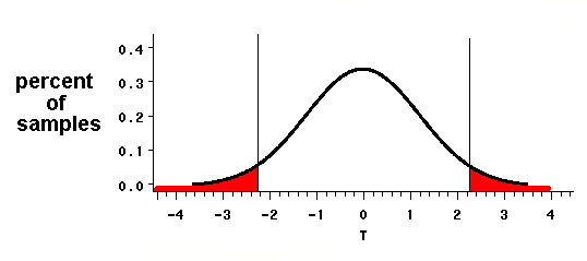
We visualize the probability a as a portion or a region on a graph that illustrates the sampling distribution of the mean when the null hypothesis is true. The solid curve depicted below represents a particular t distribution, the one where df=n-1=9. The area under the curve represents the total probability that we might produce a given t-statistic. The area under the curve, by definition, is equal to one. That is because the graphs's horizontal axis illustrates every possible value for the t statistic that we might calculate for a given sample. The vertical axis shows the probability of obtaining any particular t-value. Every possible t statistic is accounted for, so the total probability is 1.
Because the area under the t distribution's curve represents a probability of 1, regions under the curve represent probabilities that are proportional to the region's size. Two symmetrical (mirror-image) regions, one at the distribution's lower extreme and one at its upper extreme, together account for a=0.05 of the distribution's total probability.

How do we interpret these "rejection regions," whose area equals the probability a? The regions identify t values (on the horizontal axis) that are relatively far from t's expected value of zero. Were we to draw many samples from a population, a (in this case, 5 percent) of the samples would have t-values that are this far from the expected value of zero. According to our knowledge of t distributions, t values that are
- equal to or less t=-2.26 or
- equal to or greater than t=2.26
are highly unusual; they occur in only five percent of samples of size 10 drawn from a population whose mean is 6.
To illustrate the rejection regions' influence on our decisions, we "retransform" the graph's horizontal axis so that it shows sample means (xbar) instead of t values.
Recall that we transformed the sample means' distribution to a t distribution through the equation:
t = (xbar - m0) / sqrt(S2/n)
Therefore,
xbar = m0 + t * sqrt[S2/n]To achieve this transformation, we have to assume that all of the sample variances are approximately equal to one another and, further, to the population variance s2.
xbar = m0 + t * sqrt[s2/n]

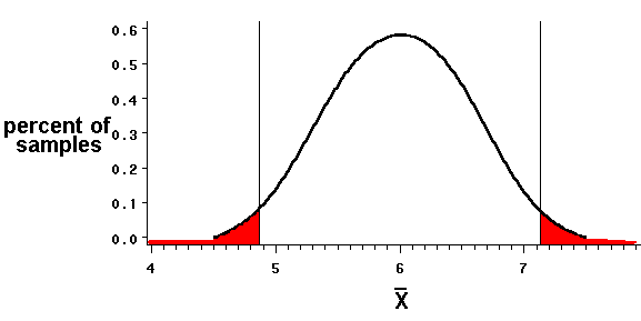
The critical values for t, -2.26 and 2.26, which define the borders of the rejection regions, are transformed to values for the sample mean of 4.87 and 7.13, respectively.
xbar = m0 +- t * sqrt[S2/n]
xbar= 6 +- 2.26*sqrt[2.5/10]
xbar = 6 +- 1.13 = 4.87 , 7.13
If the null hypothesis (H0: m=6) is true, we are unlikely (the chance is no more than than one in twenty) to draw a sample of n=10 whose mean is less than 4.87 or greater than 7.13. If we draw a sample whose mean is that large or that small, the sample is probably not part of a population with a mean of 6. Therefore, drawing a sample with such a mean justifies rejecting the null hypothesis.
Alternatively, samples whose means fall between the critical values are more likely -- the probability is at least 0.05 -- to be part of a population whose true mean equals the one we've hypothesized. These samples do not justify rejecting the null hypothesis (H0); when we draw such samples, we "fail to reject" H0.
Factors that affect the location of the rejection regions
The equation that transforms t-values into values for "xbar," the sample mean:
xbar = m0 + t * sqrt[S2/n]
suggests a way to specify the "critical" values for xbar (xbarc) that mark the rejection regions' boundaries:
xbarc = m0 +- t (a/number of tails), n-1 * sqrt[S2/n]
The equation illustrates how the critical values for xbar depend on:
- m0, the population mean that we specify under the null hypothesis
- t, a quantity determined by three a priori choices: (1) the value for a, (2) whether the hypothesis is one-tailed (directional) or two-tailed (non-directional), and (3) the choice of sample size n.
- S2, the sample variance, which we must assume equals s2, the population variance under the null hypothesis
- n, the sample size
Effect of the choice of a
The researcher chooses a value for a, the probability of making a Type 1 error. The risk of making such an error is part of the cost of making a decision. The larger the type 1 error that we accept, the larger the rejection region.
In our current example (Ho: m0=6, s2=2.5), we accepted a type 1 error of 0.05 and calculated two sample means, 4.87 and 7.13, that formed boundaries for the rejection regions.
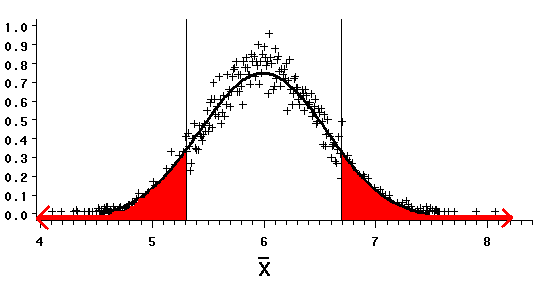
We could, before drawing a sample, accept a larger risk of committing a type 1 error. We could set a at 0.20, a one in five chance of making a type 1 error. (Admittedly, 0.20 may be a larger probability than we'd accept comfortably in practice.)
Increasing a enlarges the rejection region. Inserting this value for a into the equation yields critical values of 5.308 and 6.692 for the sample means that bound the rejection regions.

| When we accept a larger a, we are more likely to draw a sample mean that leads us to reject the null hypothesis. Of course, we are also more likely to reject the null mistakenly.
|
|---|
|
|---|
|
|---|
|
|---|
Effect of the size of the population variance, and of the sample variance that estimates it
The more diverse a population, the more likely that it contains members whose measures on some variable are relatively far from the population mean. Similarly, means of samples drawn from a highly variable population may lie relatively far from the true mean. When we draw a sample from such a diverse population, we can reject a null hypothesis only if the sample's mean (xbar) differs considerably from the hypothesized mean m0.
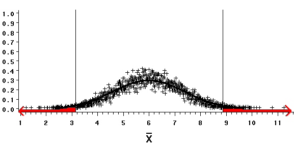
Assuming the truth of our "model" null hypothesis (H0: m=6, s2=2.5), and accepting a type 1 error probability (a) of 0.05, specifies rejection regions bounded by sample means of 4.87 and 7.13.
If we draw a sample of 10 observations to test a slightly different null hypothesis, one in which we estimate the population variance to be 16, ...
|
|---|
the equation yields values of 3.139 and 8.861 for sample means that bound the rejection regions.

| Thus, the larger our estimate of a populations' variance, the more a sample mean must differ from the hypothetical mean m0=6 before we can reject the null hypothesis.
|
|---|
|
|---|
Effect of n, the size of the sample that we use to make a statistical decision
Up to now, we have tested a specific null hypothesis (H0: m0=6; s2=2.5) by setting a at 0.05 and drawing a sample of 10 observations.
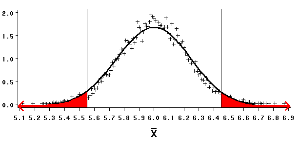
Drawing a larger sample, say one with 50 observations, estimates more precisely the mean in the population from which we've drawn the sample. The larger the sample, the smaller the sample mean's standard error.
When we estimate the population mean m0 more precisely, a sample mean need not be as distant from the hypothesized mean m0 to cause us to reject the null hypothesis.
|
|---|
When we draw a sample of 50, our equation yields critical values of 5.551 and 6.449 for the sample means that bound the rejection regions.

| These values are not as distant from the m0 of 6 as the values for xbar (4.87 and 7.13) that we calculated for a sample of 10.
|
|---|
|
|---|
Type 2 error and b
We have examined how researchers establish a null hypothesis, and identified a test statistic t whose value they evaluate to determine whether it inhabits a rejection region. To calculate the rejection regions' endpoints:
xbar = m0 +- t(a/number of tails), n-1 * sqrt[S2/n]
we must specify a priori:
- the population mean m0 under the null hypothesis
- a, an acceptable risk of committing a type 1 error
- the sample variance S2, which we assume equals the population variance s2 under the null hypothesis
- the size n of the sample that we can collect to calculate the test statistic
We can also consider the probability b that we'll fail to reject the null hypothesis even though it's untrue. This second variety of mistaken statistical decision is a "type 2 error."
The table below employs two columns to illustrate two "states of truth," one in which the null hypothesis is true, and another in which a specific alternative hypothesis (Ha) is true. Against the columns, the table lists two rows that describe the decision, based upon the test statistic, to reject or "fail to reject" the null hypothesis.
Decision (made on basis of test statistic): H0 is true Ha is true
reject H0
Type 1 error correct decision
fail to reject H0
correct decision Type 2 error
| | |
|---|
| | |
|---|
| | |
|---|
We can calculate b, the probability of making a Type 2 error, if we can specify an alternative hypothesis Ha in terms of a population mean and variance, and if we can assume that the population follows a normal distribution.
We understand the logic in two steps.
- After drawing a sample, we first decide whether its mean is consistent with the truth of the null hypothesis (H0: m0=6; s2=2.5). The figure illustrates that we retain (fail to reject) the null hypothesis if xbar is equal to or between the critical values we have calculated. If xbar is outside that region, we reject the null hypothesis.
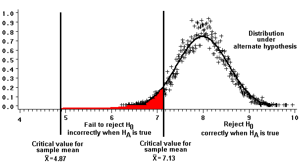
- Second, we consider the probability that we will incorrectly fail to reject H0 when a specific alternative hypothesis Ha is true. Note that we must specify an alternative hypothesis. The figure below illustrates (shaded in red) the probability of incorrectly failing to reject the null (thereby committing a type 2 error) when a specific alternate hypothesis (Ha: ma=8; s2=2.5) is true.
The curve immediately above represents the distribution of sample means (also called the "sampling distribution of the mean") under the specific alternative hypothesis. The red-shaded region accounts for 5.8 percent of the area under the curve. In other words, if the specific alternative hypothesis is true, the probability b of making a type 2 error is 0.058.
b and power
If b is the probability of making a type 2 error, then (1-b) is the probability of correctly rejecting the null hypothesis (H0) when a specific alternative hypothesis (Ha) is true. A test's ability to correctly reject the null, when an alternate hypothesis is true, is its power. When the alternate hypothesis is specified, power equals (1-b). Under the alternative hypothesis illustrated in the graph above (Ha: ma=8), given a sample of ten observations whose variance is 2.5, the test's power is 1-0.058=0.942.
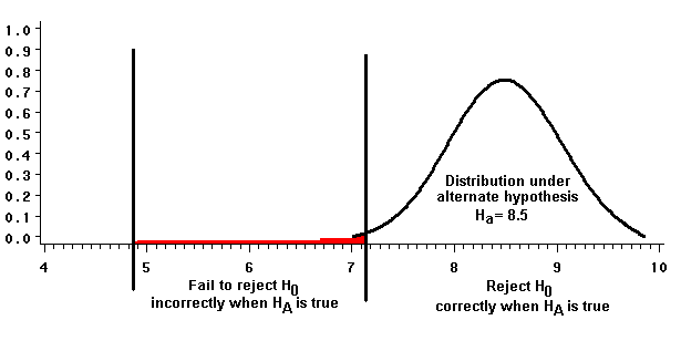
A test's power depends on the specific alternative hypothesis. If we specify Ha such that ma=8.5 and s2=2.5, and draw a sample of ten, the sample mean's power to correctly reject the null is:
(1-b) = 1 - 0.0114 = 0.98856
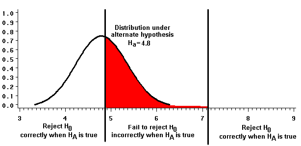
We can specify a different alternative hypothesis whose mean is closer to that of the null: Ha: ma = 4.8; s2=2.5. In this case, when we draw a sample of ten, the sample mean's power to correctly reject the null hypothesis is smaller:
(1-b)= 1 - 0.446 = 0.554
Power curves
The graphs illustrate that a test's power depends on the relative locations of:
- the "fail to reject region." The location of the rejection regions and, therefore, of the "fail to reject region," depends on the specific null hypothesis and on factors previously discussed.
- m0, the population mean that we specify under the null hypothesis
- t, a quantity determined by three a priori choices: (1) the value for a, (2) whether the hypothesis is one-tailed (directional) or two-tailed (non-directional), and (3) the choice of sample size n.
- S2, the sample variance, which we have to assume equals s2, the population variance under the null hypothesis
- n, the sample size
- the sampling distribution of means under the alternative hypothesis.
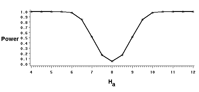
Power curves illustrate the effect on power of varying the alternate hypothesis. The curve illustrates how a sample of ten observations with a variance of 2.5 is quite powerful in correctly rejecting the null hypothesis (in this example, m0=8) when the true mean is less than 6 or greater than 10. The curve also illustrates that the test is not powerful -- it may not reject the null hypothesis even when the true mean differs from m0 -- when the difference is small.

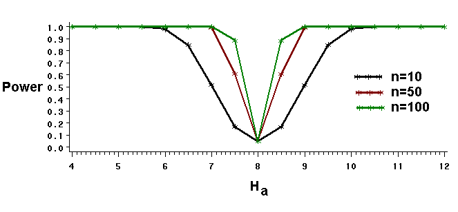
Increasing the sample size improves a test's power, as the graph below illustrates. Larger samples have the power to reject the null hypothesis correctly even when the true and hypothesized means differ very little.

Last updated 7-1-2009 © Dave Thompson


